Try These Home Decor Color Combinations with Apricot Painted Walls
You can achieve this pale orange wall color by using Benjamin Moore’s Pale Oats or Behr’s Frosted Toffee. The soft pigment creates a cheerful space, but the decor you choose is what decides the personality of the room.
Below are a few examples of color combinations you can use for bedspreads, lamps, linens and furniture. Each color has a hex code underneath it for designers who want specific information about that swatch.
I generated the room designs in Blender, a free and open source 3D creation suite.
Monochromatic Color Scheme
A monochromatic color scheme features only one color, but uses various shades, tones and tints of that color. This adds a sense of depth to your space, which is great for small rooms.
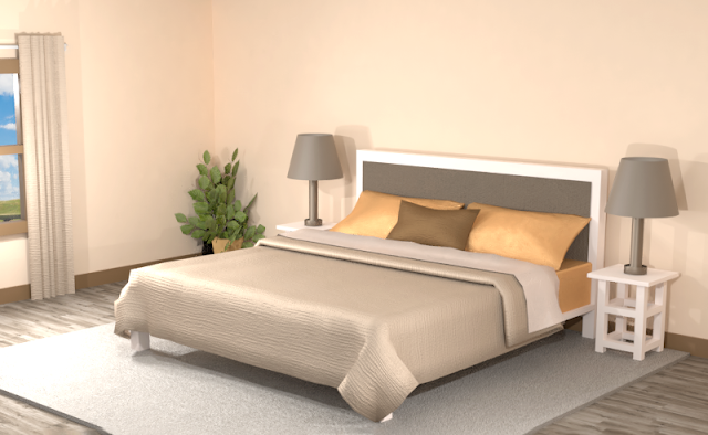
Below is an example of this monochromatic color scheme in a bedroom with Benjamin Moore's Pale Oats painted walls.
The overall impression has a sort of amber glow to it. There is a bright pop of orange in the pillow cases but the beige and brown give the room a more sedate touch.
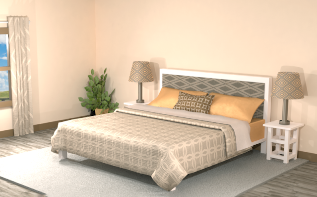
Combining some bold patterns into this monochromatic color scheme helps add a little more excitement to the room, but the overall feel is still understated.
Complementary Color Scheme
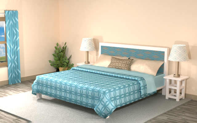
Unlike the monochromatic scheme that uses only one color, the complementary color scheme uses two. These two colors are opposite on the color wheel, creating a stronger contrast.
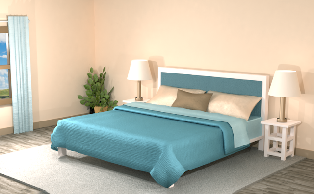
The bold teal in this color scheme takes center stage, with the walls now more of a backdrop for this vibrant hue. If you want teal as the main emphasis in your room, you might want to think about painting your walls with Benjamin Moore's Pale Oats paint.
Adding patterns and mixing the hues of the color scheme creates a more cohesive and dynamic look in the room. Consider adding more neutrals to your space if the teal is too overpowering for you.
Split Complementary Color Scheme
A Split Complementary Color Scheme uses three colors. You begin with one color and then locate its complement (the color opposite on the color wheel) then use the two colors on either side of it.
Using a split complementary color scheme usually adds more variation to your room without being too overpowering or bold. With this combination, you have warm and cool colors to use throughout your space.
The dark purple adds a strong contrast against the pale orange hue of the walls and pillows. The earthy green acts like more of a neutral color that tames the space. The emphasis stays on the walls and in places where the light orange appears in the decor, such as the pillows.
Blending the split complementary theme into contrasting patterns gives the room more vibrancy. The light cyan contrasted against the dark green on the bedspread is now the emphasis in the room. Consider using more solid colors instead of patterns if you want a more serene appearance to your room.
Double Split Complementary Color Scheme
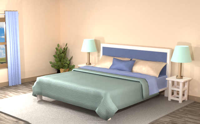
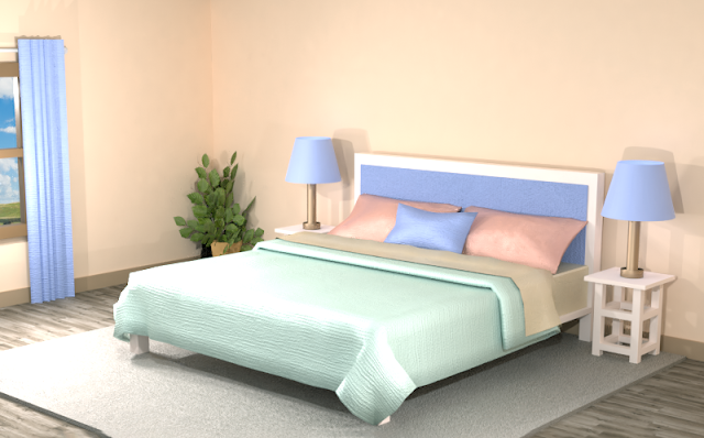
In a double split complementary scheme, we use a combination of four colors that is made up of two complementary color pairs. (Complementary colors are opposite each other on the color wheel.)
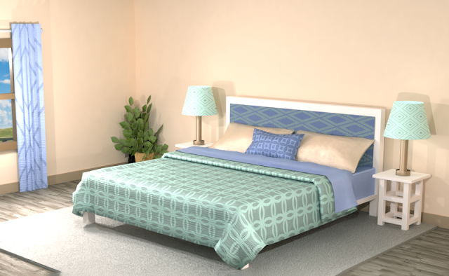
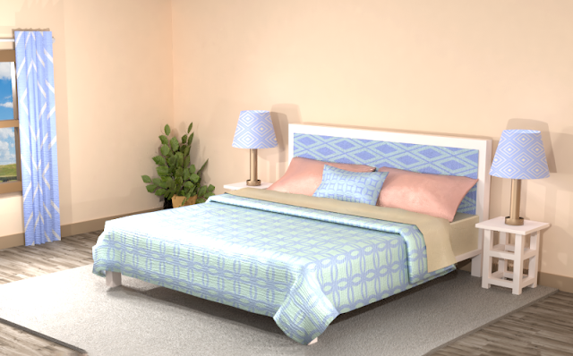
This color combination features pastel cyan, yellow and orange across from a bold blue and a deep salmon. This color combination can be fun to use, but may appear disjointed if used only in solid colors. Creating patterns will blend the bright hues together and create a more unified look.
This space looks more cohesive but might also benefit with more darker hues added to the space.
Triad Color Scheme
Last but not least, a triad color scheme consists of three colors evenly spaced across the color wheel. This kind of color combination adds more drama to your space but is also pleasing to the eye.
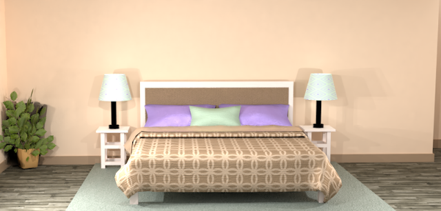
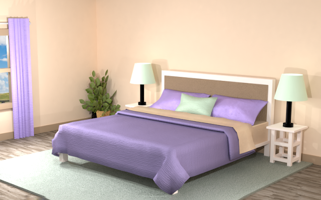
The triad color scheme in the room below creates a fun atmosphere. The mint and pale orange play against the royal purple, earthy brown and bright purple. The main emphasis in the room is the deep and light purple colors.
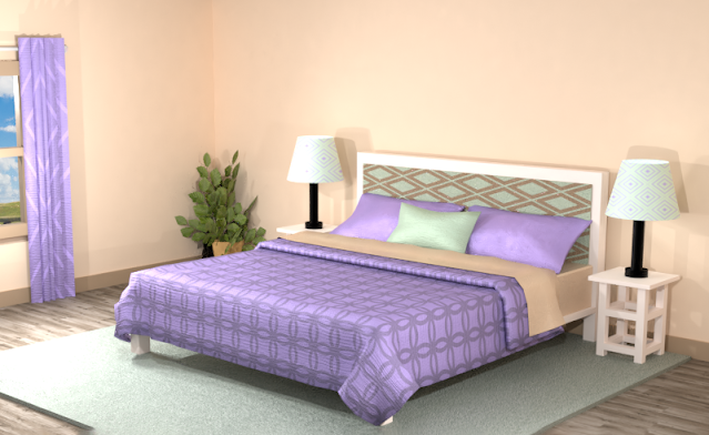
The room below with added patterns and textures is more exciting but loses the dramatic tone of the first room with solid colors.
Did you see anything you like? Remember, you can always tone down the look of a room by featuring neutrals and then using the different hues of the color combinations for accents.
Searching for New Ideas for your Graphic Design?
Do you create pins on Pinterest or design any of your own graphics for social media platforms?
Then try any of the color combinations featured in this article in your own designs to create visually pleasing artwork that stands out from the crowd!








Comments
Post a Comment