Try These Home Decor Color Combinations with Gray Painted Walls
You can achieve this dark gray wall color by using Benjamin Moore’s Coventry Gray or Sherwin-Williams 7658 Gray Clouds. Gray walls can bring a modern style to your room, but the furnishings you add can either bring excitement or create a sense of calmness.
Below are a few examples of color combinations you can use for bedspreads, lamps, linens and furniture. Each color has a hex code underneath it for designers who want specific information about that swatch.
I generated the room designs in Blender, a free and open source 3D creation suite.
Monochromatic Color Scheme
A monochromatic color scheme features only one color, but uses various shades, tones and tints of that color. This adds a sense of depth to your space, which is great for small rooms.
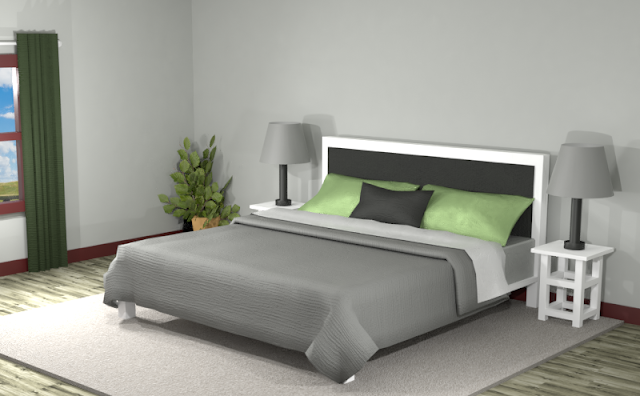
There seems to be some yellow and blue in the Benjamin Moore's Coventry Gray pigment, which generated a bright green swatch on the color wheel. Below is an example of this monochromatic color scheme in a bedroom.
The bright green creates a pop of color on the pillow cases where the dark grays and blacks create a contrast against the added white. The overall appearance is mellow, but some patterns and textures can give it some excitement.
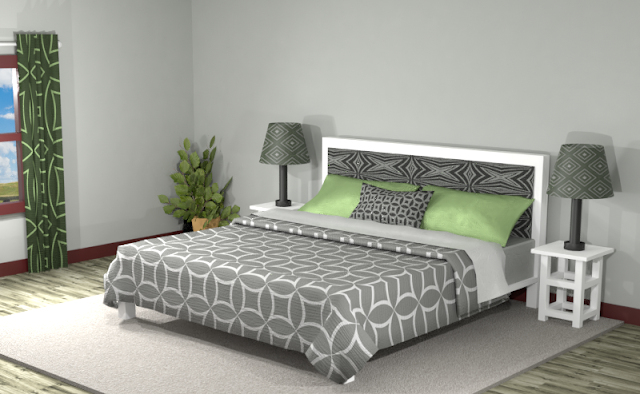
Now this room looks more exciting and balanced, as the gray and white checkered bedspread takes away some of the emphasis of the green pillows.
Complementary Color Scheme
Unlike the monochromatic scheme that uses only one color, the complementary color scheme uses two. These two colors are opposite on the color wheel, creating a stronger contrast.
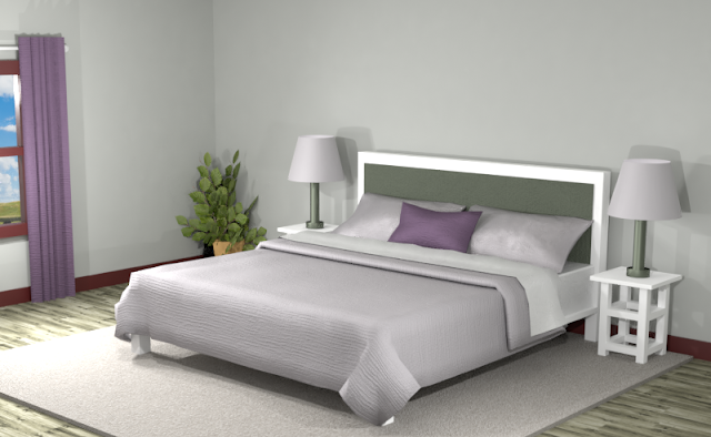
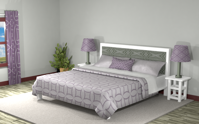
Below is an example of this complementary color scheme. The light purple in the lampshades and bedspread have the same tonal value as the gray, which gives it an understated appearance. The dark green headboard and dark purple curtains create some vibrancy, but the general look is somewhat flat. Let’s add some patterns and textures to see if this color palate can work for you.
With patterns added in the picture below, the effect is still understated but with a little more vibrancy in the room.
Split Complementary Color Scheme
A Split Complementary Color Scheme uses three colors. You begin with one color and then locate its complement (the color opposite on the color wheel) then use the two colors on either side of it.
Using a split complementary color scheme adds more variation to your room without being too overpowering or bold. With this combination, you have warm and cool colors to use throughout your space.
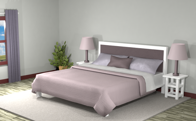
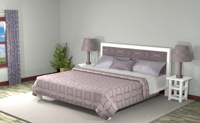
The deep purple and mauve creates some dark neutrals to the room, but adding white gives more contrast while still retaining the serene effect of the muted colors.
Mixing the darker and lighter values into patterns gives this room more energy while still maintaining an elegant appearance.
Double Split Complementary Color Scheme
In a double split complementary scheme, we use a combination of four colors that is made up of two complementary color pairs. (Complementary colors are opposite each other on the color wheel.)
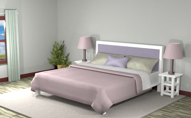
Applying a double split complementary color scheme creates more color variations. In this color scheme, we get more vibrant pinks, purples and greens.
These hues have more vibrancy against the gray walls, but the similar tonal values create an understated look without much contrast between them.
Using lighter shades of the colors and mixing them into patterns makes this room more exciting, as seen below.
Triad Color Scheme
Last but not least, a triad color scheme consists of three colors evenly spaced across the color wheel. This kind of color combination adds more drama to your space but is also pleasing to the eye.
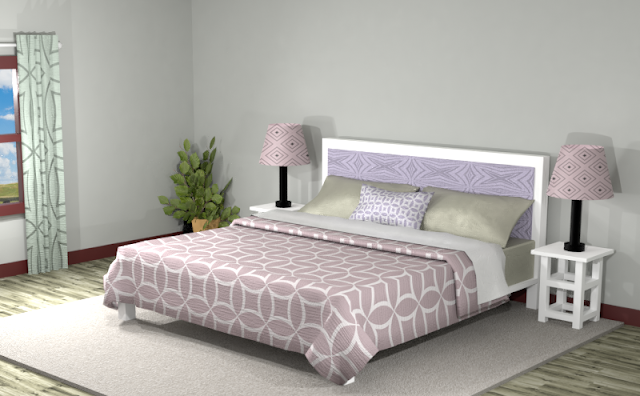
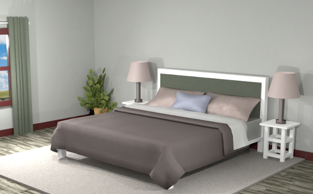
This triad color scheme has both dark and medium values. Adding white to the room lets each color stand out.
The deep brown and green gives and nice contrast for the light pink and purple hues. The overall look is warm and inviting.
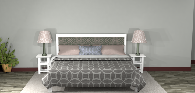
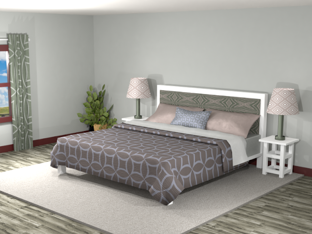
The room below with added patterns and textures is more exciting but loses the dramatic atmosphere of the first room with solid colors.
Did you see anything you like? Remember, you can always tone down the sharpness of a room by featuring neutrals and then using the different color combinations for accents.
Searching for New Ideas for your Graphic Design?
Do you create pins on Pinterest or design any of your own graphics for social media platforms?
Then try any of the color combinations featured in this article in your own designs to create visually pleasing artwork that stands out from the crowd!







Comments
Post a Comment