Try These Home Decor Color Combinations with Dark Pumpkin Painted Walls
You can achieve this dark pumpkin wall color by using Benjamin Moore’s Firenze or Behr’s Thanksgiving. The mixture of spice brown and orange in the pigment creates a warm environment, but the decor you choose is what will bring vitality into your room.
Below are a few examples of color combinations you can use for bedspreads, lamps, linens and furniture. Each color has a hex code underneath it for designers who want specific information about that swatch.
I generated the room designs in Blender, a free and open source 3D creation suite.
Monochromatic Color Scheme
A monochromatic color scheme features only one color, but uses various shades, tones and tints of that color. This adds a sense of depth to your space, which is great for small rooms.
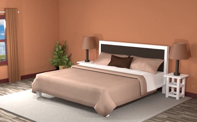
Below is an example of this monochromatic color scheme in a bedroom with Benjamin Moore’s Firenze painted walls.
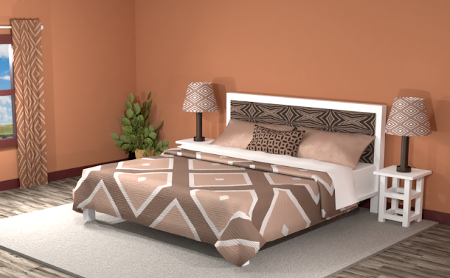
The spicy orange wall color pops against the neutral tones of the monochromatic color scheme. Try combining more white and black shades to add more contrasting tones to this room.
Complementary Color Scheme
Unlike the monochromatic scheme that uses one color, the complementary color scheme uses two. These two colors are opposite on the color wheel, creating a stronger contrast.
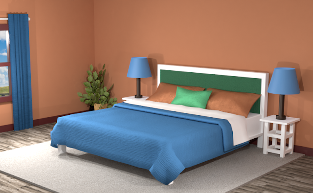
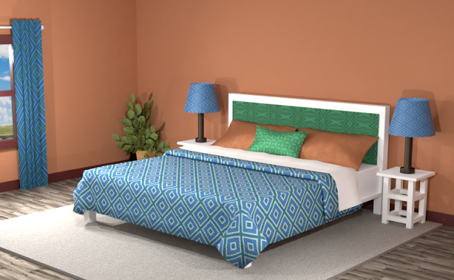
In this complementary color theme, the vibrant teal takes center stage, competing for attention against the dark pumpkin walls. If teal is your favorite color, consider painting your walls in this dark orange hue to give it a pop.
Adding patterns to your fabrics and combining the orange and teal hues creates a more neutral space, but with increased energy of linear shapes throughout the room.
Split Complementary Color Scheme
A Split Complementary Color Scheme uses three colors. You begin with one color and then locate its complement (the color opposite on the color wheel) then use the two colors on either side of it.
Using a split complementary color scheme adds more variation to your room. With this combination, you have warm and cool colors to use throughout your space.
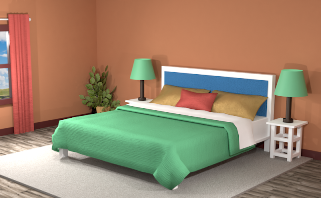
This split complementary theme showcases vibrant blue and green shades. These colors really bounce against the dark pumpkin walls. If you are looking a more understated look, you may want to avoid this split complementary color theme.
In the room below, combining the swatches into patterns helps to diffuse the flashiness of the contrasting colors, but the bright greens and blues still stand out from the crowd.
Double Split Complementary Color Scheme
In a double split complementary scheme, we use a combination of four colors that is made up of two complementary color pairs. (Complementary colors are opposite each other on the color wheel.)
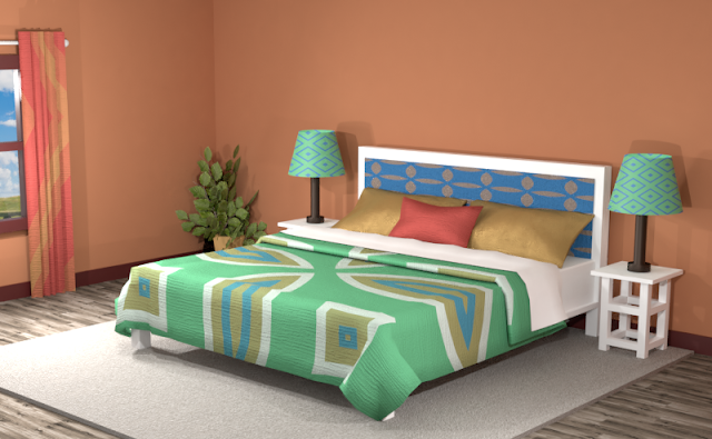
This double split theme also features blue and green, along with red and a burnt orange. There’s still the same challenge of the split complementary as before, as the colors create a strong visual weight against the dark pumpkin walls.
Adding bold patterns creates a vibrant space for a child’s room or playroom, or any area you want to have with bright pops of color as the main focal point.
In the room below, blending the colors into small patterns creates a more neutral space with less emphasis on the greens and blues.
Triad Color Scheme
Last but not least, a triad color scheme consists of three colors evenly spaced across the color wheel. This kind of color combination adds more drama to your space but is also pleasing to the eye.
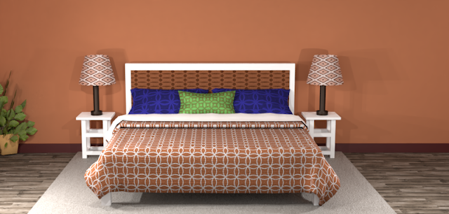
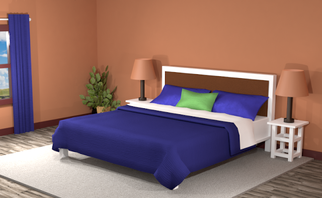
The dark royal blue in this triad color theme creates a rich foreground color against the pumpkin walls. The bright green and blue adds dashes of color. A dark brown offers a neutral tone to give the room more uniformity.
Creating patterns from these colors adds more visual interest but has less of a cozy feel than the solid colors.
Did you see anything you like? Remember, you can always tone down the look of a room by featuring neutrals and then using the different hues of the color combinations for accents.
Searching for New Ideas for your Graphic Design?
Do you create pins on Pinterest or design any of your own graphics for social media platforms?
Then try any of the color combinations featured in this article in your own designs to create visually pleasing artwork that stands out from the crowd!









Comments
Post a Comment