Try These Color Designs with Dark Teal Painted Walls
This dark teal wall color can be achieved by using Benjamin Moore's Aegean Teal paint or Sherwin-Williams SW 7617 Mediterranean. The mixture of blue, green and gray in the pigment creates a calming atmosphere, but the decor you choose is what will bring life into your room.
Below are a few examples of color combinations you can use for bedspreads, lamps, linens and furniture. Each color has a hex code underneath it for designers who want specific information about that swatch.
The room designs were generated in Blender, a free and open source 3D creation suite.
Monochromatic Color Scheme
A monochromatic color scheme features only one color, but uses various shades, tones and tints of that color. This adds a sense of depth to your space, which is great for small rooms.
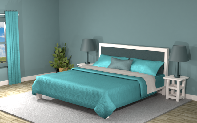
Below is an example of this monochromatic color scheme in a bedroom with Benjamin Moore's Aegean Teal walls.
The cyan-blue creates an emphasis on the pillows and bed spread while the dark bluish-green on the headboard gives contrast. The overall appearance is harmonious but could use some patterns and textures to bring it all together.
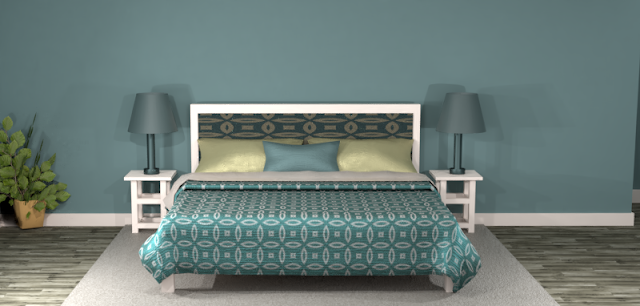
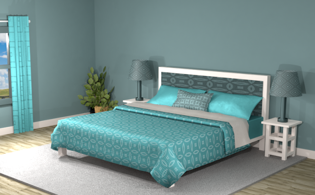
Patterns and textures can add more vibrancy to a room with a monochromatic color scheme, but don’t overdo it if you want to keep your space uncluttered and balanced.
Complementary Color Scheme
Unlike the monochromatic scheme that uses only one color, the complementary color scheme uses two. These two colors are opposite on the color wheel, creating a stronger contrast.
Below is an example of this complementary color scheme in a bedroom with Benjamin Moore's Aegean Teal walls. The lampshades and pillows have a striking contrast against the walls and other decor. The dark brown bedspread gives an earthy and calming effect to the room, but maybe a little too dark, depending on your taste. Try adding patterns to lighten up the space.
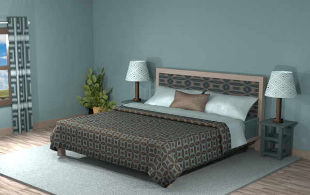
The room below looks more blended and vibrant but looses the warm, cozy effect of the solid colors in the previous example.
Split Complementary Color Scheme
A Split Complementary Color Scheme uses three colors. You begin with one color and then locate its complement (the color opposite on the color wheel) then use the two colors on either side of it.
Using a split complementary color scheme adds more variation to your room without being too overpowering or bold. With this combination, you have warm and cool colors to use throughout your space.
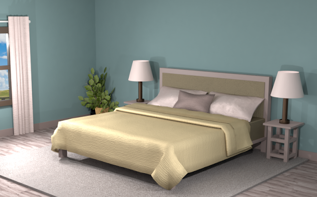
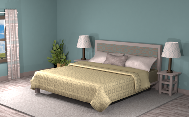
The soft pink lampshades, curtains and pillow cases really stand out against the dark teal walls, but the yellow bedspread is the one that is prominent in the room. Maybe it is too much of an emphasis, depending on your feelings about the color yellow.
Blending the split complementary theme into different patterns helps to blend the overall effect of the room and diminish unwanted focal points. Combine the room with more neutral hues such as gray and beige if the color theme is too overpowering.
Double Split Complementary Color Scheme
In a double split complementary scheme, we use a combination of four colors that is made up of two complementary color pairs. (Complementary colors are opposite each other on the color wheel.)
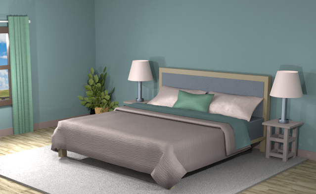
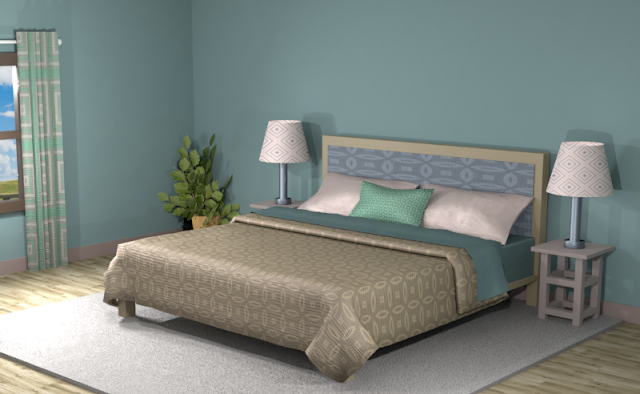
Creating a lighter shade of the dark-mauve (#CfCAC9) in the lampshades and the pillows creates more variation in the room. Without this alteration, this double split complementary combination would look too muted overall.
Using lighter shades of all the colors and mixing them into patterns makes this room more exciting, as seen below.
Triad Color Scheme
Last but not least, a triad color scheme consists of three colors evenly spaced across the color wheel. This kind of color combination adds more drama to your space but is also pleasing to the eye.
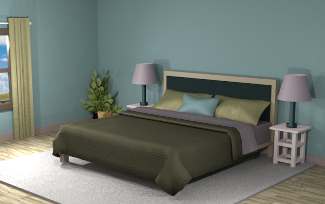
The triad color scheme in the room below creates a dark and cozy atmosphere to the space. Using solid colors gives a more tranquil aura to the room.
The olive green and purple stand out against the darker hues. The deep brown bed spread gives a dramatic feel but can also be lightened up by combining the dark hues with the lighter ones.
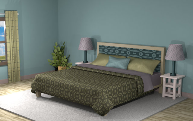
The room below with added patterns and textures is more exciting but loses the striking atmosphere of the first room with solid colors.
Did you see anything you like? Remember, you can always tone down the look of a room by featuring neutrals and then using the different hues of the color combinations for accents.
Searching for New Ideas for your Graphic Design?
Do you create pins on Pinterest or design any of your own graphics for social media platforms?
Then try any of the color combinations featured in this article in your own designs to create visually pleasing artwork that stands out from the crowd!








Comments
Post a Comment