You can achieve this wall color by using Benjamin Moore’s Red or Behr’s Flirt Alert. This stimulating hue creates an energizing atmosphere, but how you match your home decor may make or break the room.
Below are a few examples of color combinations you can use for bedspreads, lamps, linens and furniture. Each color has a hex code underneath it for designers who want specific information about that swatch.
I generated the room designs in Blender, a free and open source 3D creation suite.
Monochromatic Color Scheme
A monochromatic color scheme features only one color, but uses various shades, tones and tints of that color. This adds a sense of depth to your space, which is great for small rooms.
Do you like the color red? You better, with this color scheme.
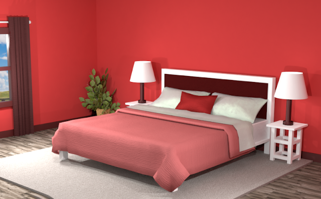
We’ve got your deep-red walls, light-red bedspread, dark-red headboard and curtains. While the red hues bring a lot of energy to this room, the solid colors can make the space fall flat. Let’s add some variety with textures and patterns.
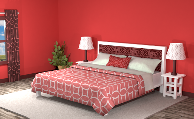
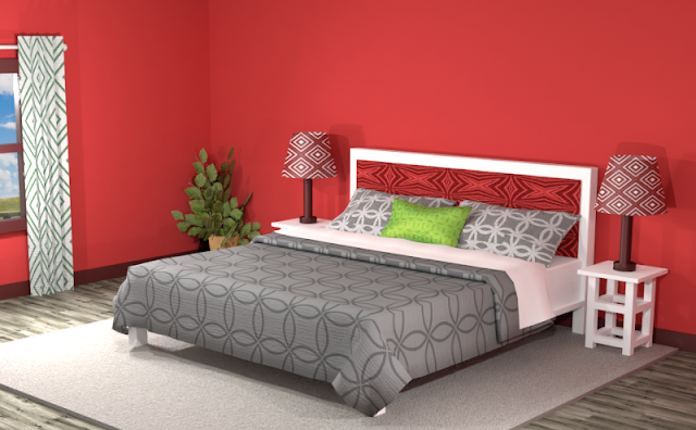
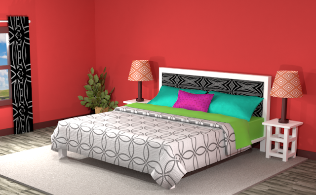
The room below looks more fun. The bold patterns with white and black included offer a bold contrast against the red walls. If you’re in love with the color red, this monochromatic color scheme might work for you.Complementary Color Scheme
Unlike the monochromatic scheme that uses only one color, the complementary color scheme uses two. These two colors are opposite on the color wheel, creating a stronger contrast.
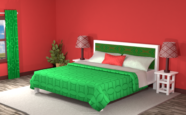
Merry Christmas! Below is an example of this complementary color scheme in a bedroom with Benjamin Moore's red painted walls. The color opposite of red on the color wheel is green, which makes for a festive room for sure.Split Complementary Color Scheme
A Split Complementary Color Scheme uses three colors. You begin with one color and then locate its complement (the color opposite on the color wheel) then use the two colors on either side of it.
Using a split complementary color scheme usually adds more variation to your room without being too overpowering or bold. With this combination, you have warm and cool colors to use throughout your space.
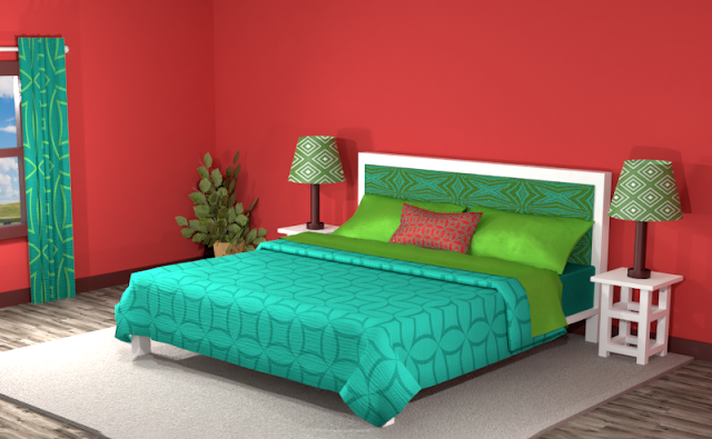
In this split complementary, the effect still has a powerful contrast between the reds and the greens. The addition of a dark and light teal softens the look and adds appeal to the space.
Adding more neutrals creates areas of interest where the red and the green create pops of color. The white bedspread in the picture below blends in more with the other neutrals in the room and the focal point now becomes the red pillow against the contrasting teal and green. Still a little “Christmassy,” but not too bad.
Double Split Complementary Color Scheme
In a double split complementary scheme, we use a combination of four colors that is made up of two complementary color pairs. (Complementary colors are opposite each other on the color wheel.)
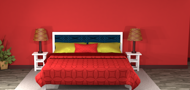
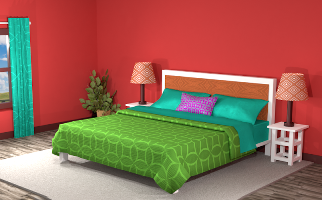
Wow. The double split complementary combination gives us many options. Green, teal, an orangey-red… and purple. Seems a bit challenging but let’s put it all together and see what we get.This space does not lack excitement. If you like these colors but don’t want all the thrill, try adding more neutral values to the room.
Triad Color Scheme
Last but not least, a triad color scheme consists of three colors evenly spaced across the color wheel. This kind of color combination adds more drama to your space but is also pleasing to the eye.
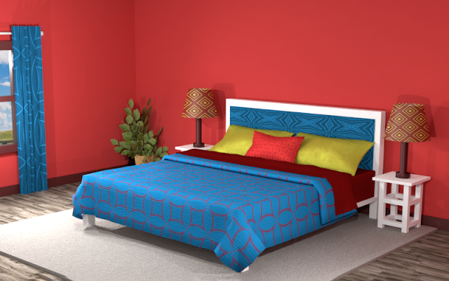
This triad color scheme in the room below creates an air of royalty to the space with the dark red and blues. The lime-green stands out amongst the darker hues, creating a strong focal point.
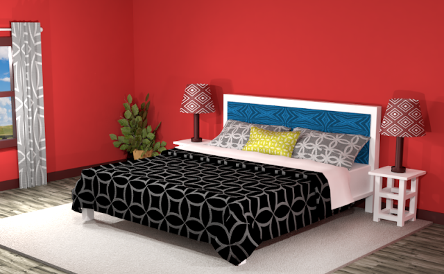
Did you see anything you like? Remember, you can always tone down the look of a room by featuring neutrals and then using the different hues of the color combinations for accents.
Searching for New Ideas for your Graphic Design?
Do you create pins on Pinterest or design any of your own graphics for social media platforms?
Then try any of the color combinations featured in this article in your own designs to create vibrant artwork that stands out from the crowd!








Comments
Post a Comment