Try These Home Decor Color Combinations with French Lilac Painted Walls
You can achieve this lilac wall color by using Benjamin Moore’s French Lilac paint. This medium-purple pigment creates a serene atmosphere to enjoy your time in, but the decor you choose is what will bring life into your room.
Below are a few examples of color combinations you can use for bedspreads, lamps, linens and furniture. Each color has a hex code underneath it for designers who want specific information about that swatch.
I generated the room designs in Blender, a free and open source 3D creation suite.
Monochromatic Color Scheme
A monochromatic color scheme features only one color, but uses various shades, tones and tints of that color. This adds a sense of depth to your space, which is great for small rooms.
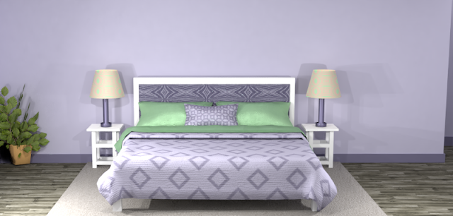
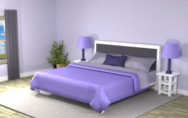
Hello purple! The monochromatic color scheme generated dark, light and vibrant purples. You would have to love the color purple to try this in your room. The lilac walls seem muted against the dark purple headboard and the vivid lamps and bedspread. The overall atmosphere of the room seems inspiring—if you like the color purple.
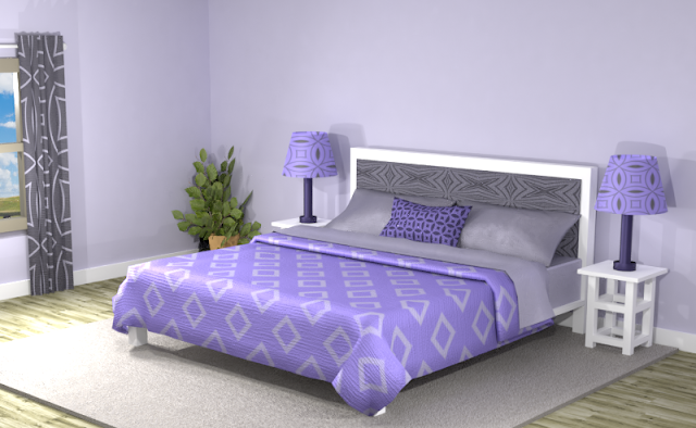
Incorporating some patterns in the mix makes this room more energized, but don’t overdo it if you want to keep your space uncluttered and balanced.
Adding more neutrals such as beige and gray could remove some of the emphasis of the purple, if that’s what you want. You can also try another color scheme below.Complementary Color Scheme
Unlike the monochromatic scheme that uses only one color, the complementary color scheme uses two. These two colors are opposite on the color wheel, creating a stronger contrast.
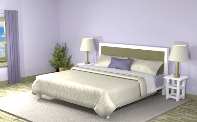
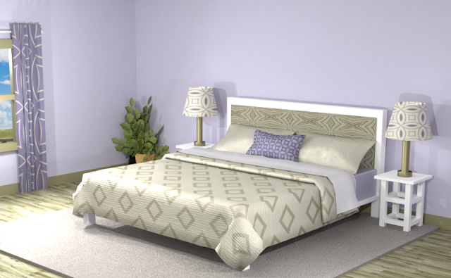
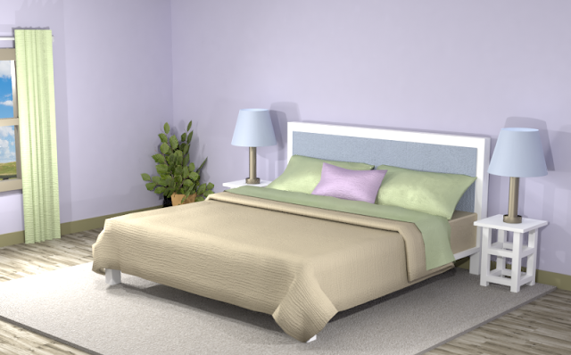
Below is an example of this complementary color scheme in a bedroom with Benjamin Moore's French Lilac walls. The color scheme includes a light beige and a dark olive green, which tones down the atmosphere of the room. The deep purple adds some contrast to the light beige. The room appears serene, but can look more inspired with patterns.
Split Complementary Color Scheme
A Split Complementary Color Scheme uses three colors. You begin with one color and then locate its complement (the color opposite on the color wheel) then use the two colors on either side of it.
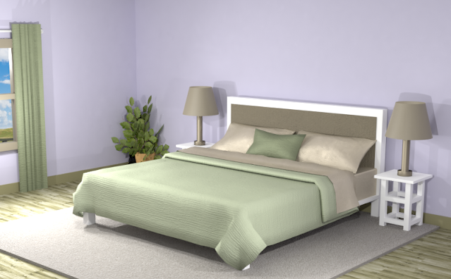
Using a split complementary color scheme adds more variation to your room without being too overpowering or bold. With this combination, you have warm and cool colors to use throughout your space.In the room below, the earthy shades create more neutral tones as the lilac walls take center stage. If you want the emphasis to be on your walls, then this color mixture may be right for you.
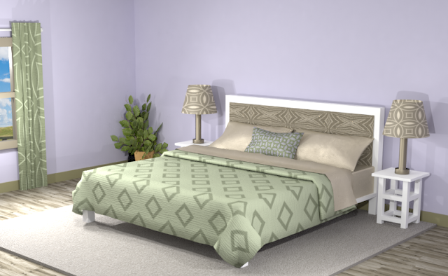
Double Split Complementary Color Scheme
In a double split complementary scheme, we use a combination of four colors that is made up of two complementary color pairs. (Complementary colors are opposite each other on the color wheel.)
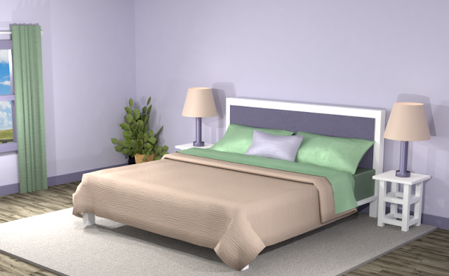
This color scheme produced a variety of colors including pink, blue, orange and green—all competing for attention against the purple walls. On their own as solid colors, the room seems a little disjointed. Time to add some patterns!
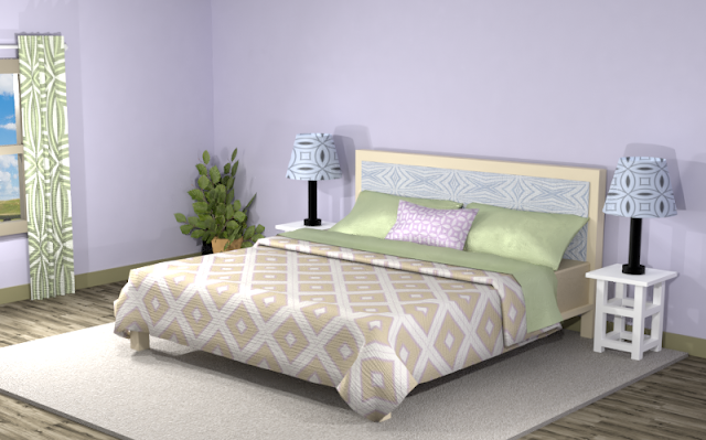
Triad Color Scheme
Last but not least, a triad color scheme consists of three colors evenly spaced across the color wheel. This kind of color combination adds more drama to your space but is also pleasing to the eye.
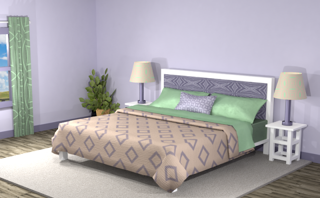
Did you see anything you like? Remember, you can always tone down the look of a room by featuring neutrals and then using the different hues of the color combinations for accents.
Searching for New Ideas for your Graphic Design?
Do you create pins on Pinterest or design any of your own graphics for social media platforms?
Then try any of the color combinations featured in this article in your own designs to create visually pleasing artwork that stands out from the crowd!








Comments
Post a Comment