Try These Home Decor Color Combinations with Black Painted Walls
You can achieve this rich, dark wall tone by using Benjamin Moore’s 2132-10 Black or Behr’s N520-7D Carbon. The mixture of red and blue in the pigment creates a purplish undertone, creating a passionate atmosphere, but the decor you choose is what will bring energy into your room.
Below are a few examples of color combinations you can use for bedspreads, lamps, linens and furniture. Each color has a hex code underneath it for designers who want specific information about that swatch.
I generated the room designs in Blender, a free and open source 3D creation suite.
Monochromatic Color Scheme
A monochromatic color scheme features only one color, but uses various shades, tones and tints of that color. This adds a sense of depth to your space, which is great for small rooms.
The white headboard creates a strong contrast against the dark wall behind it, creating a focal point that may not be wanted. The light shades of gray of the bedspread and pillowcases add a neutrality and calmness to the room.
Adding patterns to the space will help to add some vibrancy to this room with black walls.
Complementary Color Scheme
Unlike the monochromatic scheme that uses one color, the complementary color scheme uses two. These two colors are opposite on the color wheel, creating a stronger contrast.
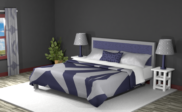
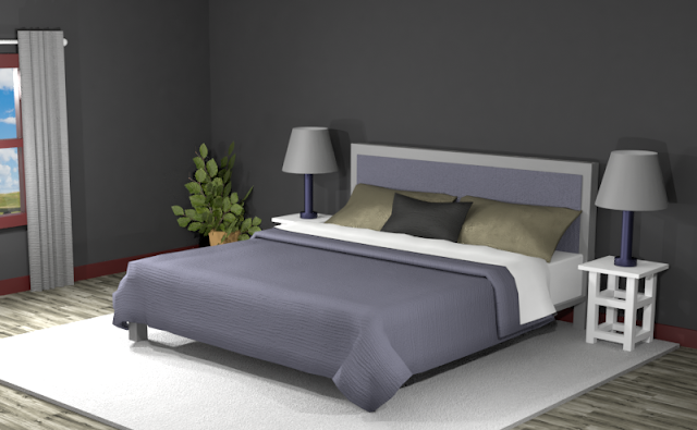
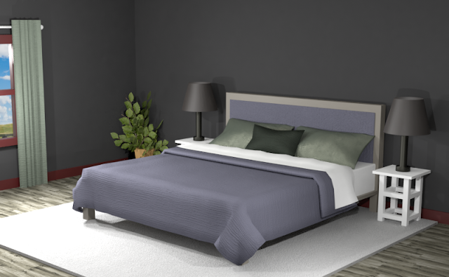
Below is an example of this complementary color scheme in a bedroom with Benjamin Moore’s 2132-10 Black walls. The color scheme produces gray and grayish purples with an olive green.
The dark tones of the swatches give a dusky appearance to the room. You can add more whites and lighter shades to brighten up the space.
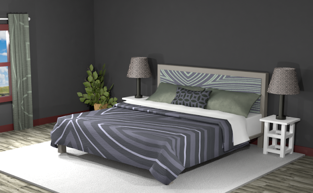
Below the room again has bold patterns, with the focus on the shades of white. This creates a fun, dynamic space against the deep, clandestine walls.
Split Complementary Color Scheme
A Split Complementary Color Scheme uses three colors. You begin with one color and then locate its complement (the color opposite on the color wheel) then use the two colors on either side of it.
Using a split complementary color scheme adds more variation to your room without being too overpowering or bold. With this combination, you have warm and cool colors to use throughout your space.
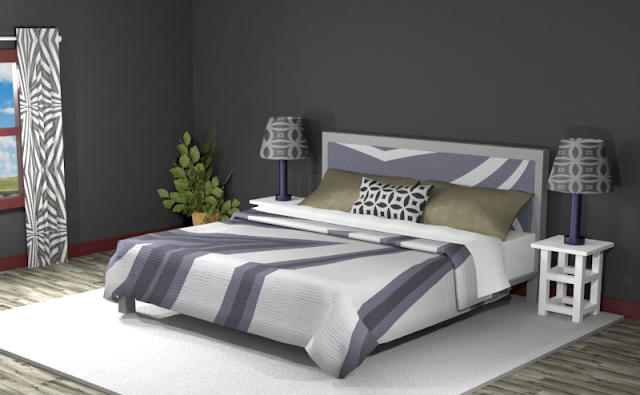
This split complementary theme has a medium shade of olive green and a pewter brown against deep shades of brown and green. The overall appearance is dark except for the added white elements.
Adding more white and creating detailed patterns creates a more sophisticated looking space. The dark olive green pillows give a little pop against the dark headboard and the bedspread appears to be more of a light neutral tone with energetic multi-toned lines.
Double Split Complementary Color Scheme
In a double split complementary scheme, we use a combination of four colors that is made up of two complementary color pairs. (Complementary colors are opposite each other on the color wheel.)
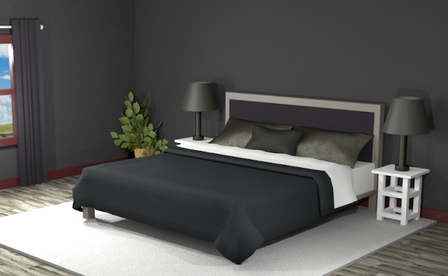
This triad color scheme is fit for Nosferatu’s Lair, but let’s give it a try, anyway. While this combination has only shades of black, there are slight variations in their tint. Still, it is difficult to tell one from another.
Lightening the swatches to a more pale hue, you can see shades of dusty purple, brown, and grayish-blue.
Triad Color Scheme
Last but not least, a triad color scheme consists of three colors evenly spaced across the color wheel. This kind of color combination adds more drama to your space but is also pleasing to the eye.
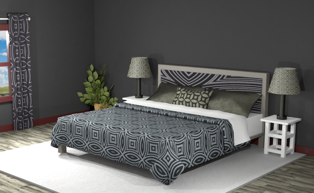
This triad color scheme features a deep brown and green as well as medium tones. The overall appearance can be quite dark if not combined with white or lighter shades. The muted deep purple creates a neutral tone throughout the room as the green adds contrast.
Add some large patterns to the space with lighter tones to create a dynamic room with black walls.
Did you see anything you like?
Searching for New Ideas for your Graphic Design?
Do you create pins on Pinterest or design any of your own graphics for social media platforms?
Then try any of the color combinations featured in this article in your own designs to create visually pleasing artwork that stands out from the crowd!







Comments
Post a Comment