Try These Home Decor Color Combinations with Light Blue-Green Painted Walls
You can achieve this blue-green wall color by using Benjamin Moore’s Palladian Blue. The mixture of blue, green and gray in the pigment creates a tone that has a calming effect, but the decor you choose is what will bring life into your room.
Below are a few examples of color combinations you can use for bedspreads, lamps, linens and furniture. Each color has a hex code underneath it for designers who want specific information about that swatch.
I generated the room designs in Blender, a free and open source 3D creation suite.
Monochromatic Color Scheme
A monochromatic color scheme features only one color, but uses various shades, tones and tints of that color. This adds a sense of depth to your space, which is great for small rooms.
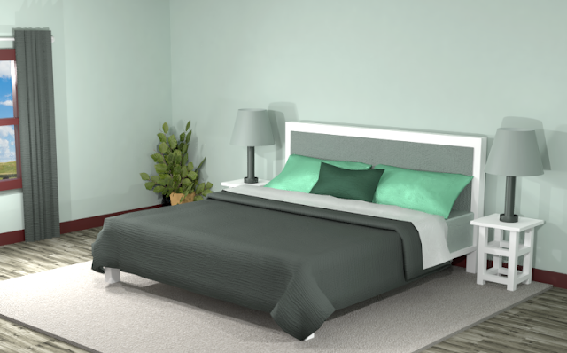
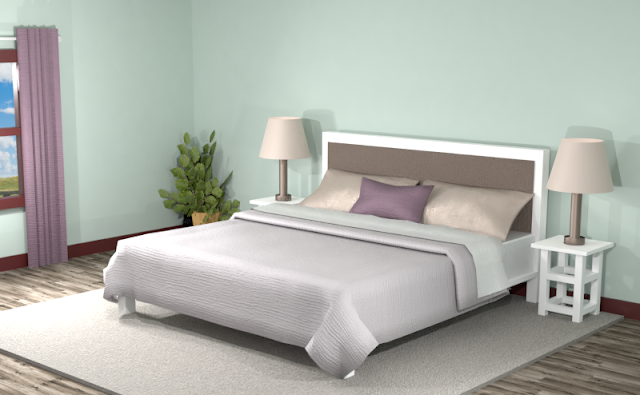
Below is an example of this monochromatic color scheme in a bedroom with Benjamin Moore’s Palladian Blue painted walls. Dark green, gray and a mint green are featured in this combination. The monochromatic hues create a serene atmosphere while the mint green gives the space a little pop.
Complementary Color Scheme
Unlike the monochromatic scheme that uses one color, the complementary color scheme uses two. These two colors are opposite on the color wheel, creating a stronger contrast.
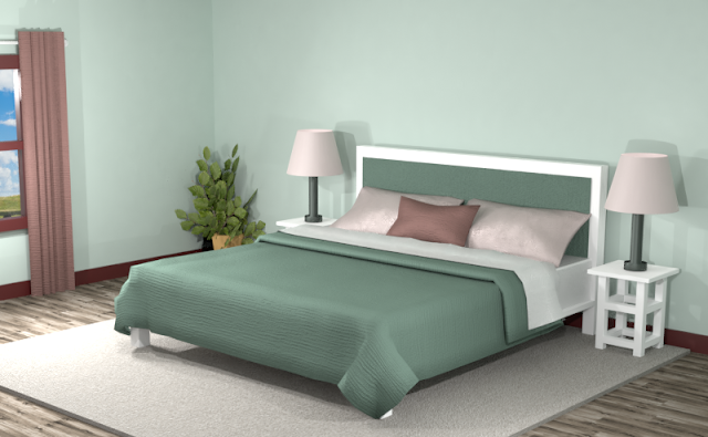
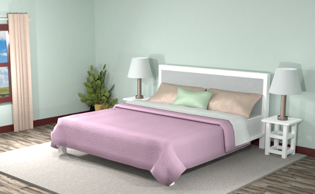
This color scheme has a deep mauve and a light pink, as well as a dark green to add contrast to the pale blue-green walls. The tone to the space is serene, yet the contrasting pinks give the space a little vibrancy.
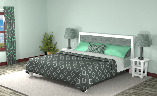
The room below looks more blended and vibrant, but the overall tone is more neutral compared to the room with solid colors.
Split Complementary Color Scheme
A Split Complementary Color Scheme uses three colors. You begin with one color and then locate its complement (the color opposite on the color wheel) then use the two colors on either side of it.
Using a split complementary color scheme adds more variety to your room without being too overpowering or bold. With this combination, you have warm and cool hues to use throughout your space.
In the room below, the dusty purple and orange give variation to the space without being too overpowering. The brown and the earthy purple add neutral tones to the area to create a serene place to hang out.
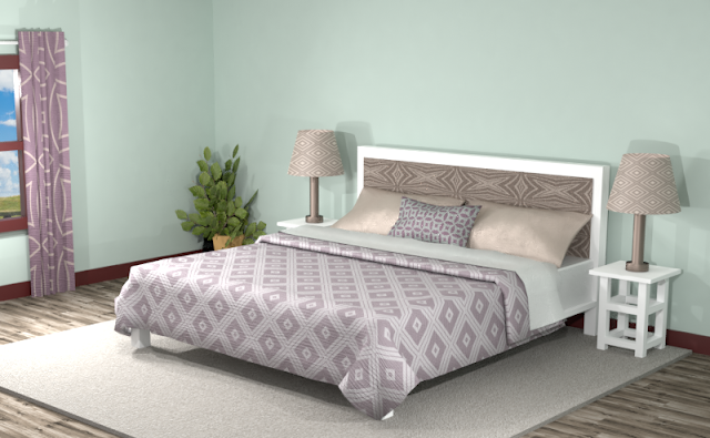
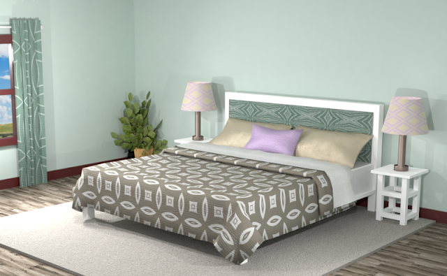
Adding patterns to this split complementary room creates more excitement, even though the overall look is more blended.
Double Split Complementary Color Scheme
In a double split complementary scheme, we use a combination of four colors that is made up of two complementary color pairs. (Complementary colors are opposite each other on the color wheel.)
In this double split complementary theme, the pink stands out from the crowd along with the dusty orange and mint green. The combination is great for a person with a colorful nature.
Triad Color Scheme
Last but not least, a triad color scheme consists of three colors evenly spaced across the color wheel. This kind of color combination adds more drama to your space but is also pleasing to the eye.
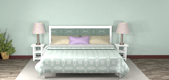
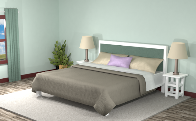
The triad color scheme in the room below creates a balanced and calm space with just a bit of vibrancy with the lilac hue. The dark and green swatches add contrast to the area as the purple and orange contribute some sparkle.
The room below with added patterns and textures is a more lively place without going too over the top.
Did you see anything you like?
Remember, you can always tone down the look of a room by featuring neutrals and then using the different hues of the color combinations for accents.
Searching for New Ideas for your Graphic Design? Do you create pins on Pinterest or design any of your own graphics for social media platforms?
Then try any of the color combinations featured in this article in your own designs to create visually pleasing artwork that stands out from the crowd!








Comments
Post a Comment