Try These Home Decor Color Combinations with Light Pink Walls
You can achieve this light pink wall color by using Benjamin Moore’s First Light or Behr’s Prelude to Pink. The light dusty rose pigment creates a serene atmosphere, but the decor you choose is what will bring life into your room.
Below are a few examples of color combinations you can use for bedspreads, lamps, linens and furniture. Each color has a hex code underneath it for designers who want specific information about that swatch.
I generated the room designs in Blender, a free and open source 3D creation suite.
Monochromatic Color Scheme
A monochromatic color scheme features only one color, but uses various shades, tones and tints of that color. This adds a sense of depth to your space, which is great for small rooms.
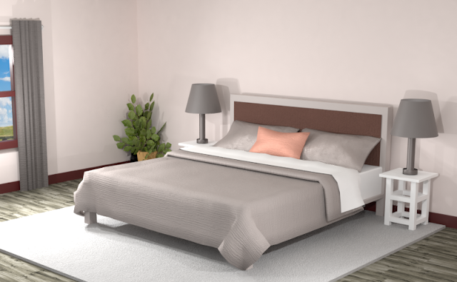
Below is an example of this monochromatic color scheme in a bedroom with Benjamin Moore’s First Light painted walls.
The light pink create a soothing atmosphere in the room and the complementary colors give a balanced look. There is a bright pop of orange in this color scheme to use for emphasis in areas throughout the room.
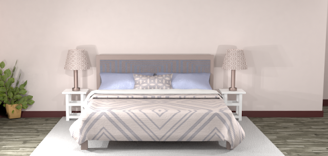
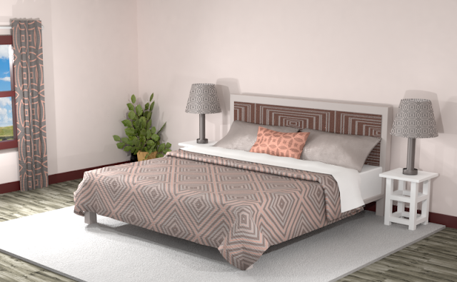
Including patterns in this color scheme creates some vibrancy but can also mute the tones if overdone. Try including more black and white hues to add more exciting elements to the room.
Complementary Color Scheme
Unlike the monochromatic scheme that uses one color, the complementary color scheme uses two. These two colors are opposite on the color wheel, creating a stronger contrast.
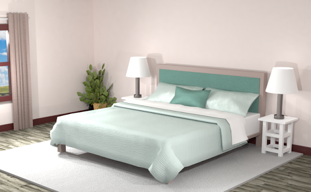
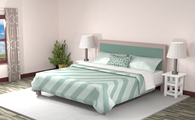
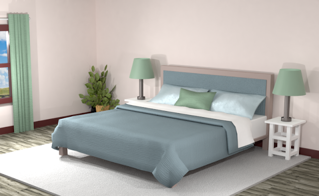
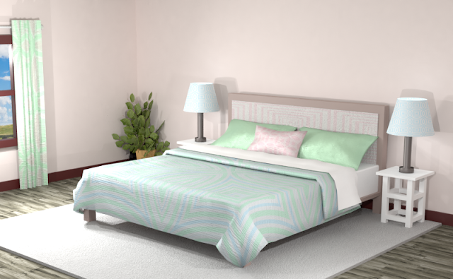
The dark and light teal swatches create an interesting arrangement against the light pink walls. The medium brown also adds a neutral element. The overall appearance is a soft pastel room to use for a hidden retreat.
In the room below, creating patterns with the dark and light teal swatches makes the space more lively.
Split Complementary Color Scheme
A Split Complementary Color Scheme uses three colors. You begin with one color and then locate its complement (the color opposite on the color wheel) then use the two colors on either side of it.
Using a split complementary color scheme adds more variation to your room without being too overpowering or bold. With this combination, you have warm and cool colors to use throughout your space.
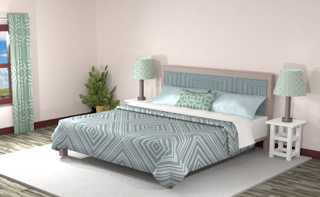
This split complementary color scheme creates a more bold, yet sophisticated look, for the room. The medium teal and green contrasts against the light pink, white, and light blue shades.
Blending the split complementary theme into different patterns helps to blend the overall effect of the room.
Double Split Complementary Color Scheme
In a double split complementary scheme, we use a combination of four colors that is made up of two complementary color pairs. (Complementary colors are opposite each other on the color wheel.)
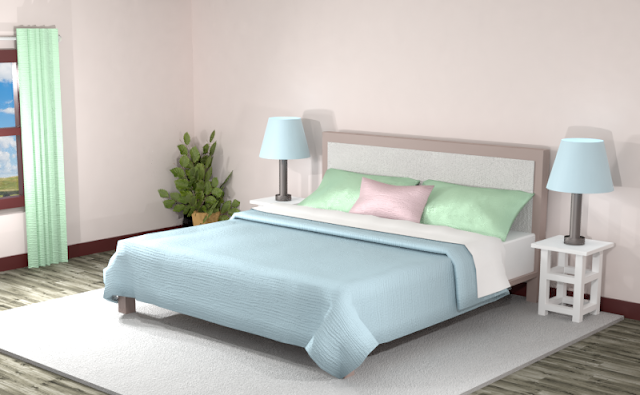
Applying a double split complementary color scheme can sometimes create a more neutral tone throughout the room because there isn’t very much variation in the contrast of tones. But in this color scheme, the pastel green and blue adds a lot of vibrancy to the room.
Creating patterns out of the colors does seem to dull them a bit, because as stated earlier, the values of the colors are very similar to one another. Adding black and white adds more contrasting tones to the room.
Triad Color Scheme
Last but not least, a triad color scheme consists of three colors evenly spaced across the color wheel. This kind of color combination adds more drama to your space but is also pleasing to the eye.
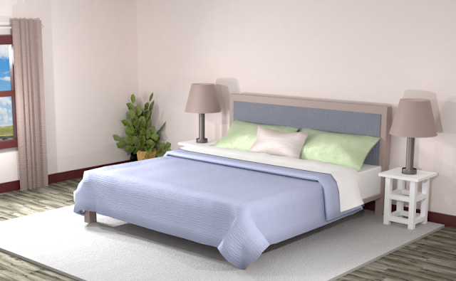
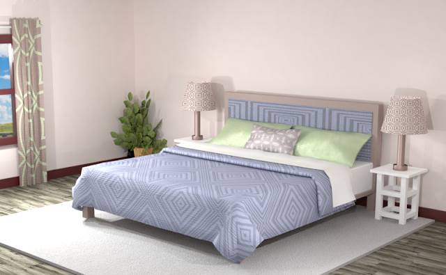
This triad color theme adds a light-blue and green to the mix. The blue radiates a strong pop of color against the light pink backdrop, but the green values create the highest contrast, making them more of a focal point. The medium brown gives a neutral element to the room.
The room below with added patterns and textures is more exciting, but loses the dramatic atmosphere of the first room with solid colors.
Did you see anything you like? Remember, you can always tone down the look of a room by featuring neutrals and then using the different hues of the color combinations for accents.
Searching for New Ideas for your Graphic Design?
Do you create pins on Pinterest or design any of your own graphics for social media platforms?
Then try any of the color combinations featured in this article in your own designs to create visually pleasing artwork that stands out from the crowd!







Comments
Post a Comment