Try These Home Decor Color Combinations with Pewter Painted Walls
You can achieve this wall color by using Benjamin Moore’s Revere Pewter or Behr’s Sculptor Clay. This earthy pigment can create a serene atmosphere, and the decor you choose will bring vitality to your space.
Below are a few examples of color combinations you can use for bedspreads, lamps, linens and furniture. Each color has a hex code underneath it for designers who want specific information about that swatch.
I generated the room designs in Blender, a free and open source 3D creation suite.
Monochromatic Color Scheme
A monochromatic color scheme features only one color, but uses various shades, tones and tints of that color. This adds a sense of depth to your space, which is great for small rooms.
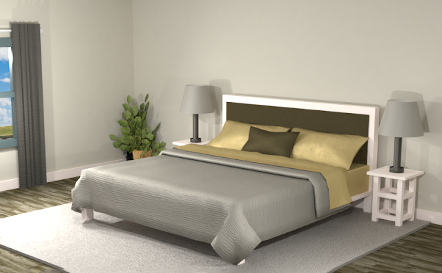
Below is an example of this monochromatic color scheme in a bedroom with Benjamin Moore's Revere Pewter walls. In this combination, an orange hue creates the emphasis in the room. The dark browns generate a strong contrast against the pewter backdrop of the walls and the other furnishings.
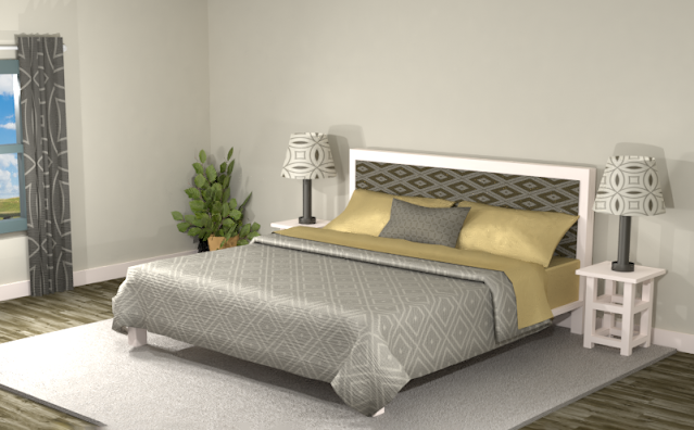
While this room is quite serene, adding some patterns may liven it up a bit. In the room below, the overall look is more harmonized, giving it a softer yet more energized feel. The orange pillowcases and sheets still create the main focal point.
Complementary Color Scheme
Unlike the monochromatic scheme that uses only one color, the complementary color scheme uses two. These two colors are opposite on the color wheel, creating a stronger contrast.
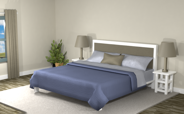
This color scheme adds a dark earthy brown to compliment the pewter walls. In addition, the dark and light blue hues add some excitement to the space as they contrast against the subdued walls and decor.
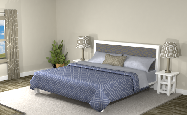
Creating patterns from this color scheme softens the look of the contrasting cool blue against the warm pewter hues. The room below looks more blended and vibrant.
Split Complementary Color Scheme
A Split Complementary Color Scheme uses three colors. You begin with one color and then locate its complement (the color opposite on the color wheel) then use the two colors on either side of it.
Using a split complementary color scheme adds more variation to your room without being too overpowering or bold. With this combination, you have warm and cool colors to use throughout your space.
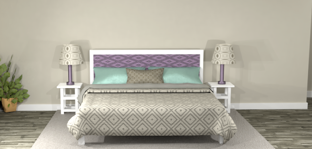
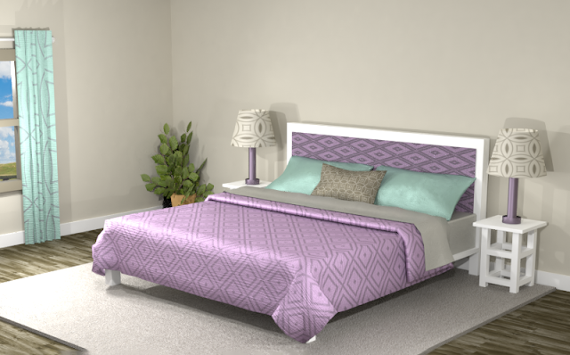
Below, the lilac purple lampshades and bedspreads stand out against the earthy pewter walls, and the dark teal and purple adds a dark contrast. This light purple takes center stage in this room while the other hues stay more in the backdrop. If lilac is your favorite color, you might want to consider Benjamin Moore's Revere Pewter walls to make this light purple stand out.
Blending this split complementary theme into patterns helps to blend the lilac shades into the overall theme, but the lilac purple still captures the eye in this color combination.
Double Split Complementary Color Scheme
In a double split complementary scheme, we use a combination of four colors that is made up of two complementary color pairs. (Complementary colors are opposite each other on the color wheel.)
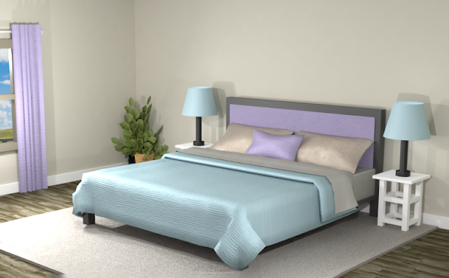
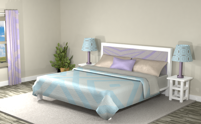
This double split color combination moves away from the earthy feel the pewter walls provide to a more playful look. Now a light blue competes against the purple for your attention, and the natural walls and decor stay in the backdrop.
Combining the neutral pewter colors with the purple and blue creates a softer atmosphere in the room, as this double split complementary theme does not offer much contrast between the colors. Try adding black and white for a more dynamic space.
Triad Color Scheme
Last but not least, a triad color scheme consists of three colors evenly spaced across the color wheel. This kind of color combination adds more drama to your space but is also pleasing to the eye.
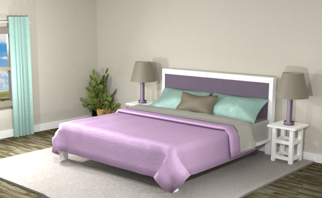
Wow. Leave it up to the triad color scheme to create something interesting. The mint green, pink and purple create an exciting scene against the pewter walls. The room looks a bit like an ice cream cone. This fun setting has mint and chocolate brown pillows, a strawberry bedspread with cone-colored walls. A great color scheme for a child’s room… or someone who really likes ice cream.
Creating patterns gives the room more energy, but it looses some of the dramatic effect of the solid colors.
Did you see anything you like? Remember, you can always tone down the look of a room by featuring neutrals and then using the different hues of the color combinations for accents.
Searching for New Ideas for your Graphic Design?
Do you create pins on Pinterest or design any of your own graphics for social media platforms?
Then try any of the color combinations featured in this article in your own designs to create visually pleasing artwork that stands out from the crowd!







Comments
Post a Comment